top of page

Projects
Here are some of my previous work, both commercial, and recreational projects.
Due to brand confidentiality, some audio is distorted and logos might be censored.

Highlighted projects
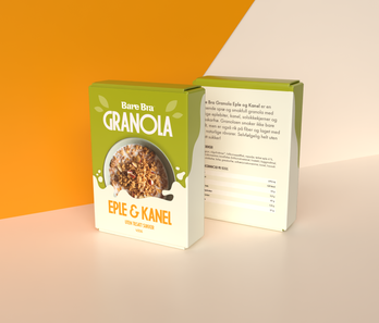
Granola Redesign
A mockup redesign of the Bare Bra Gronola packaging to make the visual elements more organized, while also looking more visually appealing and improvement in branding.
Not affiliated with Bare Bra or Orkla
Not affiliated with Bare Bra or Orkla


Modernized Marketing
This short social media reel called "Targeting the Right Audience uses kinetic type animation with a combination of 2D and 3D graphics to properly convey how Modernized Marketing can help tailor content to your target audience.


TopTier Couch Commercial VFX
I was responsible for animating a hologram VFX for TopTiers new Couch commercial for their new TopTier Academy service.
The whole process started with communication regarding the desired design, the key words was glassmorphic, clean, and simple. To achieve this, I made a few 2D animations and sketches to get feedback, before adding a slight grain and masked gaussian blur to create the sense og a matte glass texture.
To make the video easier to follow I made sure every panel animated from the previous one, so that the focus point felt consistent. I then tracked everything to the laptop, and manually keyframed the movement of the virtual camera to achieve the desired effect.
A slight camera lens blur is used for both the elements and the clip, to try and create a sense of depth in the scene and make the scene feel cleaner and more organized. I also masked the hair to ensure the search panel appeared properly according to the depth of the scene.
The result is an engaging animation that feels very natural in the scene.


Navigating Forex: A Beginnerʼs Guide
In late 2023, I undertook a series of projects for a recurring client, completing 14 to date. The animations featured vibrant colors and attention-optimized visual hierarchies. This comprehensive project, including preparatory work, design, and production phases, demonstrated my commitment to enhancing brand visibility through creative and technically sophisticated motion graphics.
I began by familiarizing myself with the client's brand, studying their platform, guidelines, and visual elements. Insights from their website and Figma board, combined with a provided audio clip, inspired creative ideas like visualizing "so easy to get lost" with a graph arrow arriving at a pathsplit. Strategic planning ensured smooth workflow, timely delivery, and high-quality outcomes.
Adhering to brand guidelines, I used their color schemes, 3D objects, glow, and lighting, adopting a quasi-skeuomorphic approach. Utilizing tools for visual attention analysis, I focused on the five visual elements our eyes are attracted to—edges, intensity, red-green contrast, blue-yellow contrast, and faces. This enabled me to create strong visual hierarchies and natural animation flow, enhancing viewer engagement.


Athletes Journey
For the MindReady “Athlete’s Journey” project, I created a 30-45 second video that illustrates the process of an athlete finding and working with a coach on the MindReady platform. This project aimed to engage athletic directors by highlighting the platform’s ease of use and the benefits it offers to athletes.
Using my expertise in motion graphics, I crafted a visually engaging video that captures the essence of the athlete’s journey. The video emphasizes the simplicity and efficiency of the MindReady platform, showcasing how athletes can easily connect with coaches, schedule sessions, and benefit from the coaching services. My creative approach ensured that the key messages were conveyed effectively, making the video a compelling tool for promoting MindReady to athletic directors.
My attention to detail and understanding of visual storytelling allowed me to produce a video that not only meets the client’s objectives but also resonates with the target audience. The final product is a testament to my ability to translate complex processes into clear, engaging, and impactful visual narratives.


introduction to MetaTrader
In late 2023, I undertook a series of projects for a recurring client, completing 14 to date. The animations featured vibrant colors and attention-optimized visual hierarchies. This comprehensive project, including preparatory work, design, and production phases, demonstrated my commitment to enhancing brand visibility through creative and technically sophisticated motion graphics.
I began by familiarizing myself with the client's brand, studying their platform, guidelines, and visual elements. Insights from their website and Figma board, combined with a provided audio clip, inspired creative ideas like visualizing "so easy to get lost" with a graph arrow arriving at a pathsplit. Strategic planning ensured smooth workflow, timely delivery, and high-quality outcomes.
Adhering to brand guidelines, I used their color schemes, 3D objects, glow, and lighting, adopting a quasi-skeuomorphic approach. Utilizing tools for visual attention analysis, I focused on the five visual elements our eyes are attracted to—edges, intensity, red-green contrast, blue-yellow contrast, and faces. This enabled me to create strong visual hierarchies and natural animation flow, enhancing viewer engagement.
I began by familiarizing myself with the client's brand, studying their platform, guidelines, and visual elements. Insights from their website and Figma board, combined with a provided audio clip, inspired creative ideas like visualizing "so easy to get lost" with a graph arrow arriving at a pathsplit. Strategic planning ensured smooth workflow, timely delivery, and high-quality outcomes.
Adhering to brand guidelines, I used their color schemes, 3D objects, glow, and lighting, adopting a quasi-skeuomorphic approach. Utilizing tools for visual attention analysis, I focused on the five visual elements our eyes are attracted to—edges, intensity, red-green contrast, blue-yellow contrast, and faces. This enabled me to create strong visual hierarchies and natural animation flow, enhancing viewer engagement.


Lofoten in Silhouettes
This is a recreational project I did to show the hikes I've been on at Lofoten. It is based on an image trace of real mountains that I climbed, then colored it for color consistency. The colors are different shades to create a sense of atmospheric perspective, where the objects further behind are lighter.
Behind the front mountain is a background mountain only made up of silhouettes. Using a path offset I could make a transition by expanding the mountain, this is also used for the photo border.
Combining a script font and a sans serif font, I could both bring character to the typography, while still achieving good readability.
Work in progress


Heie Intro
This project is centered on producing an introductory video that highlights the simplicity and convenience of using Heie.app for lending or renting items, thereby promoting a sense of a collective marketplace. The video, set to be completed by March 12, 2024, aims to use motion graphics effectively to showcase the app's user-friendly nature and the vibrancy of its community. It is designed to conclude with a compelling call to action, encouraging viewers to gain early access to the community, fostering a strong sense of belonging and engagement among its members.


Navigating Market Volatility
In late 2023, I undertook a series of projects for a recurring client, completing 14 to date. The animations featured vibrant colors and attention-optimized visual hierarchies. This comprehensive project, including preparatory work, design, and production phases, demonstrated my commitment to enhancing brand visibility through creative and technically sophisticated motion graphics.
I began by familiarizing myself with the client's brand, studying their platform, guidelines, and visual elements. Insights from their website and Figma board, combined with a provided audio clip, inspired creative ideas like visualizing "so easy to get lost" with a graph arrow arriving at a pathsplit. Strategic planning ensured smooth workflow, timely delivery, and high-quality outcomes.
Adhering to brand guidelines, I used their color schemes, 3D objects, glow, and lighting, adopting a quasi-skeuomorphic approach. Utilizing tools for visual attention analysis, I focused on the five visual elements our eyes are attracted to—edges, intensity, red-green contrast, blue-yellow contrast, and faces. This enabled me to create strong visual hierarchies and natural animation flow, enhancing viewer engagement.
I began by familiarizing myself with the client's brand, studying their platform, guidelines, and visual elements. Insights from their website and Figma board, combined with a provided audio clip, inspired creative ideas like visualizing "so easy to get lost" with a graph arrow arriving at a pathsplit. Strategic planning ensured smooth workflow, timely delivery, and high-quality outcomes.
Adhering to brand guidelines, I used their color schemes, 3D objects, glow, and lighting, adopting a quasi-skeuomorphic approach. Utilizing tools for visual attention analysis, I focused on the five visual elements our eyes are attracted to—edges, intensity, red-green contrast, blue-yellow contrast, and faces. This enabled me to create strong visual hierarchies and natural animation flow, enhancing viewer engagement.


The Speed of Success
In late 2023, I undertook a series of projects for a recurring client, completing 14 to date. The animations featured vibrant colors and attention-optimized visual hierarchies. This comprehensive project, including preparatory work, design, and production phases, demonstrated my commitment to enhancing brand visibility through creative and technically sophisticated motion graphics.
I began by familiarizing myself with the client's brand, studying their platform, guidelines, and visual elements. Insights from their website and Figma board, combined with a provided audio clip, inspired creative ideas like visualizing "so easy to get lost" with a graph arrow arriving at a pathsplit. Strategic planning ensured smooth workflow, timely delivery, and high-quality outcomes.
Adhering to brand guidelines, I used their color schemes, 3D objects, glow, and lighting, adopting a quasi-skeuomorphic approach. Utilizing tools for visual attention analysis, I focused on the five visual elements our eyes are attracted to—edges, intensity, red-green contrast, blue-yellow contrast, and faces. This enabled me to create strong visual hierarchies and natural animation flow, enhancing viewer engagement.
I began by familiarizing myself with the client's brand, studying their platform, guidelines, and visual elements. Insights from their website and Figma board, combined with a provided audio clip, inspired creative ideas like visualizing "so easy to get lost" with a graph arrow arriving at a pathsplit. Strategic planning ensured smooth workflow, timely delivery, and high-quality outcomes.
Adhering to brand guidelines, I used their color schemes, 3D objects, glow, and lighting, adopting a quasi-skeuomorphic approach. Utilizing tools for visual attention analysis, I focused on the five visual elements our eyes are attracted to—edges, intensity, red-green contrast, blue-yellow contrast, and faces. This enabled me to create strong visual hierarchies and natural animation flow, enhancing viewer engagement.


When Forex Becomes Your Full-Time Job
In late 2023, I undertook a series of projects for a recurring client, completing 14 to date. The animations featured vibrant colors and attention-optimized visual hierarchies. This comprehensive project, including preparatory work, design, and production phases, demonstrated my commitment to enhancing brand visibility through creative and technically sophisticated motion graphics.
I began by familiarizing myself with the client's brand, studying their platform, guidelines, and visual elements. Insights from their website and Figma board, combined with a provided audio clip, inspired creative ideas like visualizing "so easy to get lost" with a graph arrow arriving at a pathsplit. Strategic planning ensured smooth workflow, timely delivery, and high-quality outcomes.
Adhering to brand guidelines, I used their color schemes, 3D objects, glow, and lighting, adopting a quasi-skeuomorphic approach. Utilizing tools for visual attention analysis, I focused on the five visual elements our eyes are attracted to—edges, intensity, red-green contrast, blue-yellow contrast, and faces. This enabled me to create strong visual hierarchies and natural animation flow, enhancing viewer engagement.
I began by familiarizing myself with the client's brand, studying their platform, guidelines, and visual elements. Insights from their website and Figma board, combined with a provided audio clip, inspired creative ideas like visualizing "so easy to get lost" with a graph arrow arriving at a pathsplit. Strategic planning ensured smooth workflow, timely delivery, and high-quality outcomes.
Adhering to brand guidelines, I used their color schemes, 3D objects, glow, and lighting, adopting a quasi-skeuomorphic approach. Utilizing tools for visual attention analysis, I focused on the five visual elements our eyes are attracted to—edges, intensity, red-green contrast, blue-yellow contrast, and faces. This enabled me to create strong visual hierarchies and natural animation flow, enhancing viewer engagement.


TopTier: Executing
In collaboration with TopTier Trader, two motion graphics projects titled "Consistency" and "Discipline vs Motivation" were developed, targeting an international audience with versions in both English and Spanish. With a focus on trading psychology, these videos highlight the crucial roles of consistency, discipline, and motivation in trading without the use of voiceovers, relying instead on visual storytelling and text overlays. Tailored to TopTier Trader’s branding, it utilizes visuals and compositions recognisable to their brand, with a faster pace and easy to consume, ideal for social media reels.

The Cost of Trading
In late 2023, I undertook a series of projects for a recurring client, completing nine to date. The animations featured vibrant colors and attention-optimized visual hierarchies. This comprehensive project, including preparatory work, design, and production phases, demonstrated my commitment to enhancing brand visibility through creative and technically sophisticated motion graphics.
I began by familiarizing myself with the client's brand, studying their platform, guidelines, and visual elements. Insights from their website and Figma board, combined with a provided audio clip, inspired creative ideas like visualizing "so easy to get lost" with a graph arrow arriving at a pathsplit. Strategic planning ensured smooth workflow, timely delivery, and high-quality outcomes.
Adhering to brand guidelines, I used their color schemes, 3D objects, glow, and lighting, adopting a quasi-skeuomorphic approach. Utilizing tools for visual attention analysis, I focused on the five visual elements our eyes are attracted to—edges, intensity, red-green contrast, blue-yellow contrast, and faces. This enabled me to create strong visual hierarchies and natural animation flow, enhancing viewer engagement.


Læsø Travel Animation
This is a personal animation + videography project I did from a trip to the Danish island Læsø, it uses advanced 2.5D animations, expression controls with Javascript for communication between sequences, advanced texturizing and color design, creating an easy to view, and beautiful video.
The project aimed to blend 2.5D animation with real footage to highlight Læsø Island's charm. Initially, a guided path animation was attempted but later replaced by a detailed 3D map to navigate the island's locations. Extensive texturizing and depth creation were pivotal, with JavaScript enabling a dynamic shadow effect for a faux 3D appearance. A high aperture and animated focal point, alongside layer-specific camera settings, achieved a tilt-lens visual, ensuring the map's readability while emphasizing selected features like the location pin.
The project utilized three color palettes, aimed to harmonize with the ocean and the beige/brown tones of the map, while also providing complementary colors for contrast, like the pin. For text, the goal was a font that's bold, legible from various angles and sizes, but also modern, fun, and mysterious. The chosen fonts were the sans serif font Arlette and the serif font Journal by Zuzana Licko, balancing readability with aesthetic appeal.


Har du en drøm?






Other projects
These are recreational, school, and course projects I have completed, these have a variety in style. Feel free to reach out if you have any questions about these projects.
bottom of page
